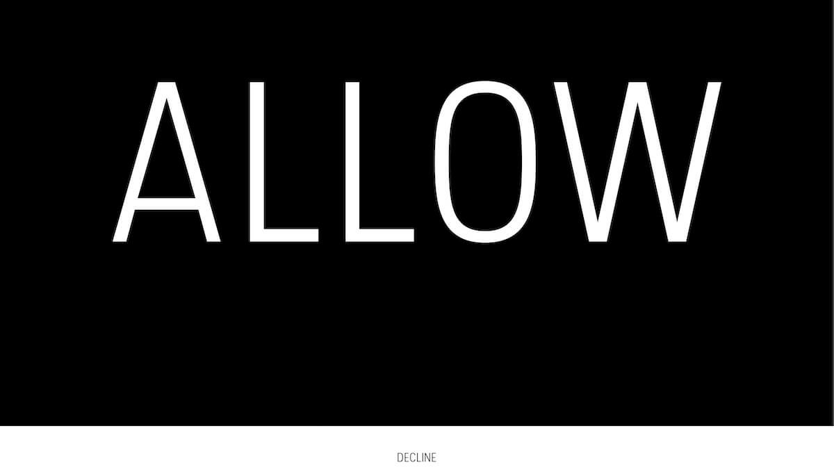
This post is the latest edition of The Web Untangled, our monthly newsletter. Sign up to receive it direct to your inbox.
Ever felt tricked into doing something online? Frustrated when a subscription is all but impossible to cancel?
Built into our online experiences, there are unfair and exploitative practices, often termed “dark patterns”, designed to manipulate or nudge us towards certain choices. Deceptive design is widespread today — and regulators are taking note. France’s data protection watchdog recently fined Google and Facebook nearly $240 million for manipulative cookie practices.
And while, say, endless searching for an “X” to close a pop-up ad may be irritating, simple frustration is not the only harm deceptive design can cause.
Bad default settings or complicated privacy setting processes can encourage users to give away more of their personal data than they may like—which is then used for surveillance advertising, and, in some cases, has also been used to discriminate on the basis of race and ethnicity and to manipulate voters to swing elections.
Deceptive user experiences can come with financial costs, too. Online retailers frequently employ deceptive timers and gamification techniques—you have 43 seconds to grab this incredible deal!—to get consumers to spend more. And in India, unsuspecting parents can soon go into debt when signing up for edtech programmes that appear “free at first glance”.
As Kat Zhou, creator of <Design Ethically>, explains:
“It’s our time, our money, and our data that’s on the line. Anti-patterns affect all of us. We deserve better.”
Here we untangle the harms of deceptive design and how we can instead move toward trusted design patterns.
How deceptive design tricks you online
I think the internet has made it easier to industrialize the way in which we persuade and, in turn, manipulate and deceive each other.
Harry Brignull | recode
Deceptive Design, by the numbers
12: Harry Brignull, who first coined the term “dark patterns”, has identified twelve main types, from bait and switch to privacy zuckering (DarkPatterns.org)
21 percent: Customers spend 21% more at ticketing site StubHub if they are not shown all fees upfront, a pattern known as drip pricing, one study found. Professor Steven Tadelis said: “I can’t think of a good reason to allow this practice in any country as the harm to consumers is clear from our study.” (Berkeley Haas)
$13 million: In 2015, Linkedin settled a lawsuit over its use of deceptive design to collect new users’ email contacts for $13 million (The Markup)
95 percent: 95% of 240 top trending apps on the Google Play Store included one or more deceptive patterns in their interfaces, according to one study. 49% of the apps included seven deceptive patterns or more (Association for Computing Machinery)
16: 16 different consumer organisations in Europe and the United States are taking action against Amazon, based on the Norwegian Consumer Council’s analysis of the Amazon Prime cancellation process (Norwegian Consumer Council)
Poll time
It’s called the “roach motel“: a design that makes it easy to get into a certain situation, like a subscription, but very hard to get out of it.
In Norway, 1 in 4 adults report experiencing difficulties cancelling a subscription to a digital content service, according to a survey from the Norwegian Consumer Council.
These struggles include:
- An annoying or time consuming cancellation process
- Difficulty contacting customer service
- A complicated website
- Not knowing how to cancel
We want to know: have you ever experienced difficulty cancelling a subscription for one of those reasons?
Deceptive design affects the most vulnerable. Inequalities offline are amplified onlineI think the internet has made it easier to industrialize the way in which we persuade and, in turn, manipulate and deceive each other.
Jasmine McNealy
📣 Discussion: The Impact of Dark Patterns on Communities of Color
🔍 Research: Shining a Light on Dark Patterns
Demystifying deceptive design
Tinder. Candy Crush. Instagram. Google Maps. Yelp. Your favorite apps may be in on the game of deception. I, Obscura, a zine from Stanford Digital Civil Society Lab, illuminates how.
Human behaviour and psychology should not be weaponised for commercial interest.
Amanda Manyame and Ridwan Oloyede | TechHive Advisory
See something, say something
Take a stand against deceptive design. Share any examples you’ve seen with the Dark Patterns Tip Line. Your tips will help hold companies accountable for these harmful practices.
Moving toward trusted design patterns
Our Tech Policy Design Lab is exploring ways to curb the widespread practice of deceptive design and move us toward trusted design patterns. We look forward to bringing together policymakers, tech companies, and researchers to co-create solutions that put people and their needs first.
Reach out to us to explore how you can participate in our free Tech Policy Design workshops and get ahead of the curve by co-creating trusted design solutions. Or share this with someone you know who’d love to get involved.
To learn more, join us for a panel discussion at MozFest on 7 March 2022.
For more updates, follow us on Twitter at @webfoundation and sign up to receive our newsletter and The Web This Week, a weekly news brief on the most important stories in tech.
Tim Berners-Lee, our co-founder, gave the web to the world for free, but fighting for it comes at a cost. Please support our work to build a safe, empowering web for everyone.
